Bootstrap-Introduce
更新日期:
Bootstrap template
1 2 3 4 5 6 7 8 9 10 11 | <!DOCTYPE html> <html> <head> <title>Bootstrap 101 Template</title> <link href="css/bootstrap.min.css" rel="stylesheet"> </head> <body> <h1>Hello, world!</h1> <script src="js/bootstrap.min.js"></script> </body> </html> |
Global Styles
In particular, the following default styles give special treatment to typography and links:
- margin has been removed from the body, and content will snug up to the edges of the browser window.
- background-color: white; is applied to the body.
- Bootstrap is using the @baseFontFamily, @baseFontSize, and @baseLineHeight attributes as our typographic base.
- Bootstrap sets the global link color via @linkColor and applies link underlines only on :hover.
Remember, if you don’t like the colors or want to change a default, this can be done by changing the globals in any of the .less files. To do this, update the scaffolding.less file or overwrite colors in your own stylesheet.
Default Grid System
The default Bootstrap grid system utilizes 12 columns, making for a 940px-wide container without responsive features enabled.
With the responsive CSS file added, the grid adapts to be 724px or 1170px wide, depending on your viewport.
Below 767px viewports, such as the ones on tablets and smaller devices, the columns become fluid and stack vertically. At the default width, each column is 60 pixels wide and offset 20 pixels to the left.
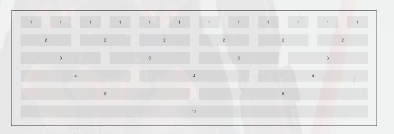
Basic Grid HTML
To create a simple layout, create a container with a <div> that has a class of
.row and add the appropriate amount of .span* columns.
Since we have a 12-column grid, we just need the amount of .span* columns to equal 12.
1 2 3 4 | <div class="row"> <div class="span8">...</div> <div class="span4">...</div> </div> |
Offsetting Columns
You can move columns to the right using the .offset* class.
Each class moves the span over that width.
1 2 3 4 | <div class="row"> <div class="span2">...</div> <div class="span7 offset2">...</div> </div> |
Nesting Columns
To nest your content with the default grid, inside of a .span*, simply add a
new .row with enough .span* that it equals the number of spans of the parent container.
1 2 3 4 5 6 7 8 9 | <div class="row"> <div class="span9"> Level 1 of column <div class="row"> <div class="span6">Level 2</div> <div class="span3">Level 2</div> </div> </div> </div> |
Fluid Grid System
The fluid grid system uses percentages instead of pixels for column widths. It has the same responsive capabilities as our fixed grid system, ensuring proper proportions for key screen resolutions and devices.
1 2 3 4 5 6 7 8 | <div class="row-fluid"> <div class="span4">...</div> <div class="span8">...</div> </div> <div class="row-fluid"> <div class="span4">...</div> <div class="span4 offset2">...</div> </div> |
Nesting a fluid grid is a little different.
Since we are using percentages, each .row resets the column count to 12.
For example, if you were inside a .span8, instead of
two .span4 elements to divide the content in half, you would use two .span6 divs
1 2 3 4 5 6 7 8 | <div class="row-fluid"> <div class="span8"> <div class="row"> <div class="span6">...</div> <div class="span6">...</div> </div> </div> </div> |
Container Layouts
To add a fixed-width, centered layout to your page, simply wrap the content in
<div class="container">...</div>.
If you would like to use a fluid layout but want to wrap
everything in a container, use the following: <div class="container-fluid">...</div>.
Using a fluid layout is great when you are building applications, administration screens, and other related projects.
Responsive Design
To turn on the responsive features of Bootstrap, you need to
add a <meta> tag to the <head> of your web page.
1 2 3 4 5 6 | <head> <title>My amazing Bootstrap site!</title> <meta name="viewport" content="width=device-width, initial-scale=1.0"> <link href="/css/bootstrap.css" rel="stylesheet"> <link href="/css/bootstrap-responsive.css" rel="stylesheet"> </head> |
Responsive design is a method for taking all of the existing content that is on the page and optimizing it for the device that is viewing it.
To target these different widths, Bootstrap uses CSS media queries to measure the width of the browser viewport and then, using conditionals, changes which parts of the stylesheets are loaded.
At the core, Bootstrap supports five different layouts, each relying on CSS media queries.
| Label | Layout width | Column width | Gutter width |
|---|---|---|---|
| Large display | 1200px and up | 70px | 30px |
| Default | 980px and up | 60px | 20px |
| Portrait tablets | 768px and up | 42px | 20px |
| Phones to tablets | 767px and below | Fluid columns, no fixed widths | |
| Phones | 480px and below | Fluid columns, no fixed widths |
To add custom CSS based on the media query, you can either include all rules in one CSS file via the media queries below, or use entirely different CSS files:
1 2 3 4 5 6 7 8 9 10 11 | /* Large desktop */
@media (min-width: 1200px) { ... }
/* Portrait tablet to landscape and desktop */
@media (min-width: 768px) and (max-width: 979px) { ... }
/* Landscape phone to portrait tablet */
@media (max-width: 767px) { ... }
/* Landscape phones and down */
@media (max-width: 480px) { ... }
|
If you are using LESS to compile the CSS, you can have them all processed into one file:
1 2 3 4 5 6 | <link rel="stylesheet" href="base.css" /> <link rel="stylesheet" media="(min-width: 1200px)" href="large.css" /> <link rel="stylesheet" media="(min-width: 768px) and (max-width: 979px)" href="tablet.css" /> <link rel="stylesheet" media="(max-width: 767px)" href="tablet.css" /> <link rel="stylesheet" media="(max-width: 480px)" href="phone.css" /> |
Helper classes
Bootstrap also includes a handful of helper classes for doing responsive development.
| Class | Phones | Tablets | Desktops |
|---|---|---|---|
| .visible-phone | Visible | Hidden | Hidden |
| .visible-tablet | Hidden | Visible | Hidden |
| .visible-desktop | Hidden | Hidden | Visible |
| .hidden-phone | Hidden | Visible | Visible |
| .hidden-tablet | Visible | Hidden | Visible |
| .hidden-desktop | Visible | Visible | Hidden |